Hello  ! I’ve been there, too, and did a lot of research for a while. modals, popups, and overlays sound very similar, but there are points that differ as well.
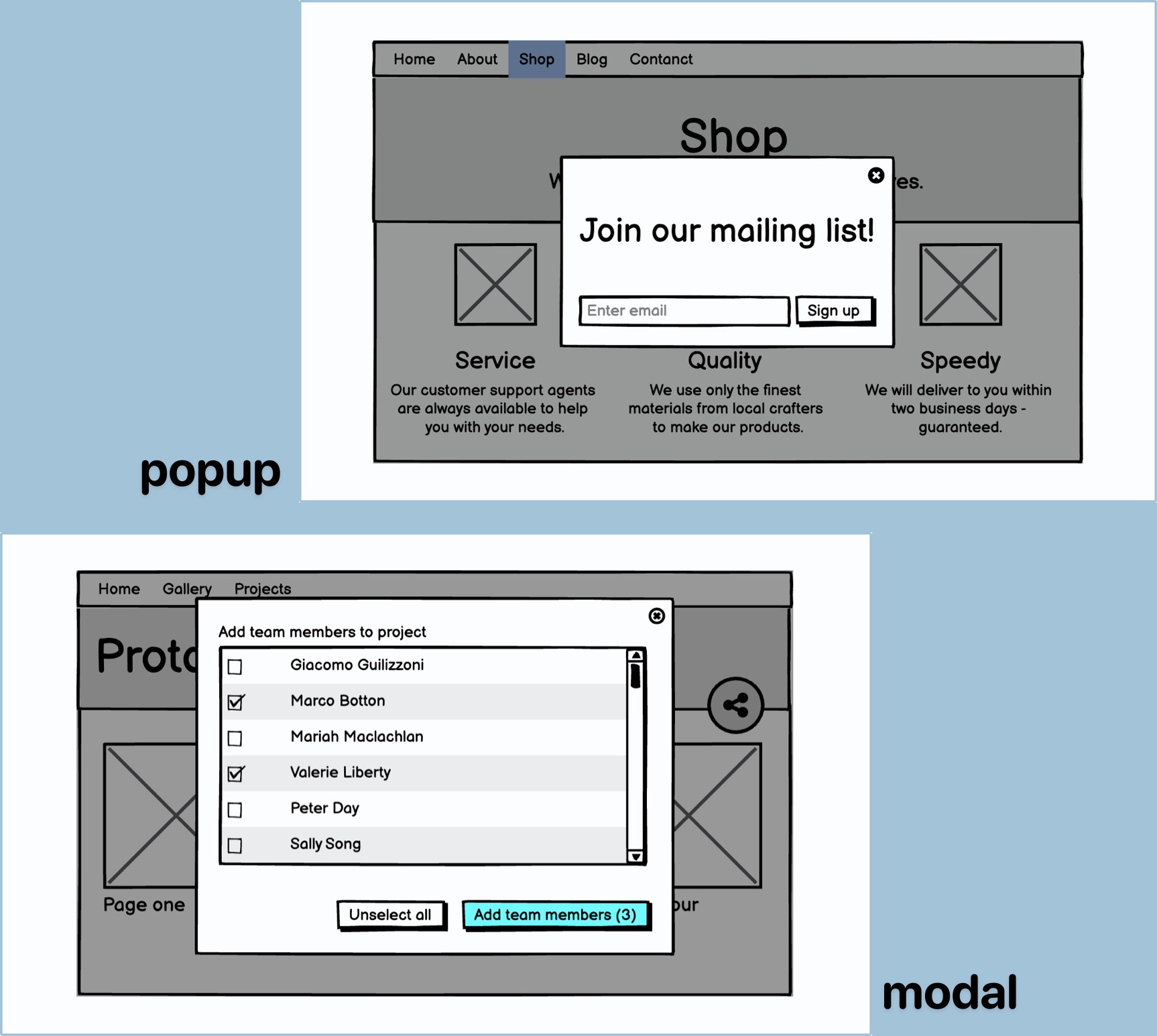
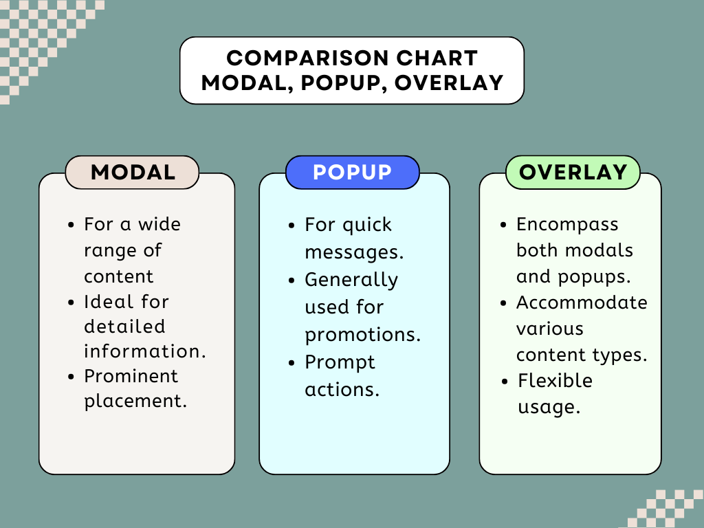
Firstly, you should know that modals are those noticeable overlay windows that pop up right in the center of your screen, often with a slightly dimmed background. They’re like your all-purpose Swiss Army knife, great for displaying forms, providing additional information, or creating interactive content.
Popups, on the other hand, are like modals’ smaller, more focused cousins. They’re designed to ‘pop up’ on top of your main content. You’ve probably seen them in action for quick messages, newsletter sign-up forms, or displaying special promotions because they are the most common ones.
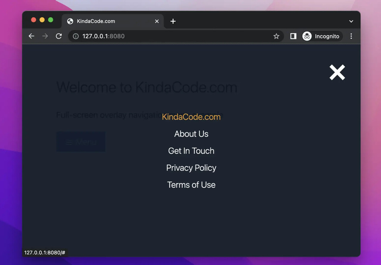
Overlay is a broader term encompassing modals and popups – essentially anything that overlays your main webpage.
These three elements are all about catching the user’s eye, but there are some crucial differences.
- Modals tend to be larger and more versatile, accommodating a wide range of content.
- Popups, on the other hand, are smaller and often used for more targeted and concise messages.
- Overlay is a term that groups them all together under the umbrella of content that overlays your main webpage.
You can employ them for various purposes, from capturing email sign-ups and showcasing product details to offering special discounts and keeping users engaged during their visit.
To make the most of modals, popups, and overlays, remember to keep the displayed content relevant and valuable for your users. Use striking visuals and clear call-to-action to engage your customers effectively. Don’t forget to provide an easy way for users to close or exit these elements, ensuring a smooth and enjoyable user experience.
On the bigger picture, utilizing these elements in your online store can have a substantial impact. They can significantly boost conversion rates, help collect email addresses for marketing campaigns, convey essential announcements to your audience, and maintain user engagement throughout their shopping journey. However, here’s the catch: use them judiciously. Overdoing it with poorly designed or excessively frequent popups can be annoying and may turn visitors away.
If you are looking for a user-friendly, no-code solution, you are in the right community. With Popupsmart, you can design engaging popups in as little as five minutes. It offers customizable templates, exit-intent triggers, and seamless integration options.
Honestly, I’m using each feature effectively for my campaigns; they have improved the game at a great scale. Popupsmart can be a valuable asset for enhancing both your store’s performance and the overall user experience. Therefore, you can give it a try to understand the difference and the impact better.
I hope I can answer your question as you need, and you can start creating effective popups that improve user engagement, conversions, and the overall success of your online business.
Here are my favorite suggestions from Popupsmart blog: