Hey @nikki
I’ve dealt with this a lot, and honestly, this is one of those things that seems easy until you actually start testing it.
Collecting emails from a landing page sounds simple on paper. Add a form, write a short line, wait for signups. But in real life, it gets more delicate than that. The moment the page starts feeling too busy or too eager, people pull back. You can almost feel that hesitation.
So the first thing I’d do is zoom out a little and look at the page itself.
Before choosing a tool, popup, or form type, I’d ask one basic question: what is this landing page mainly trying to do?
If the whole point of the page is to collect emails, then that makes the decision easier. A short form can sit much higher on the page because the signup itself is the main action.
But if the page is mainly trying to drive something else, like a purchase, a demo request, or a signup for a product, then I’d treat email capture as a secondary step. That usually works better because the page still feels focused. Visitors don’t feel like they’re being pulled in two directions.
The next thing I’d think about is placement.
A lot of people ask for the email too early. That’s usually where things start to feel forced. In most cases, I’ve seen better results when the email ask comes after the visitor has already had a chance to understand the offer. Once they’ve seen the headline, read a little, and picked up the value, the signup request feels much more natural.
The offer matters just as much as the placement.
A plain “join our newsletter” usually won’t do much unless people already trust the brand. Most visitors need a stronger reason than that. Something specific tends to work better, like a checklist, a template, a discount, early access, or some useful follow-up tied to the page itself.
That part matters a lot. If the offer feels random, even a well-placed form can fall flat. But when the offer matches the page, the whole thing feels smoother. It feels less like an interruption and more like a fair exchange.
I’d also keep the form short in the beginning.
Email only is usually the best place to start. Every extra field adds friction, and landing pages feel that friction fast. You can always test first name later if you really need it, but I wouldn’t begin there.
Only after sorting those basics out would I start thinking about popups.
Popups can work well, but only when they show up at the right moment. I wouldn’t throw one at people the second they land. That almost always feels too aggressive, especially on a page where attention is fragile to begin with.
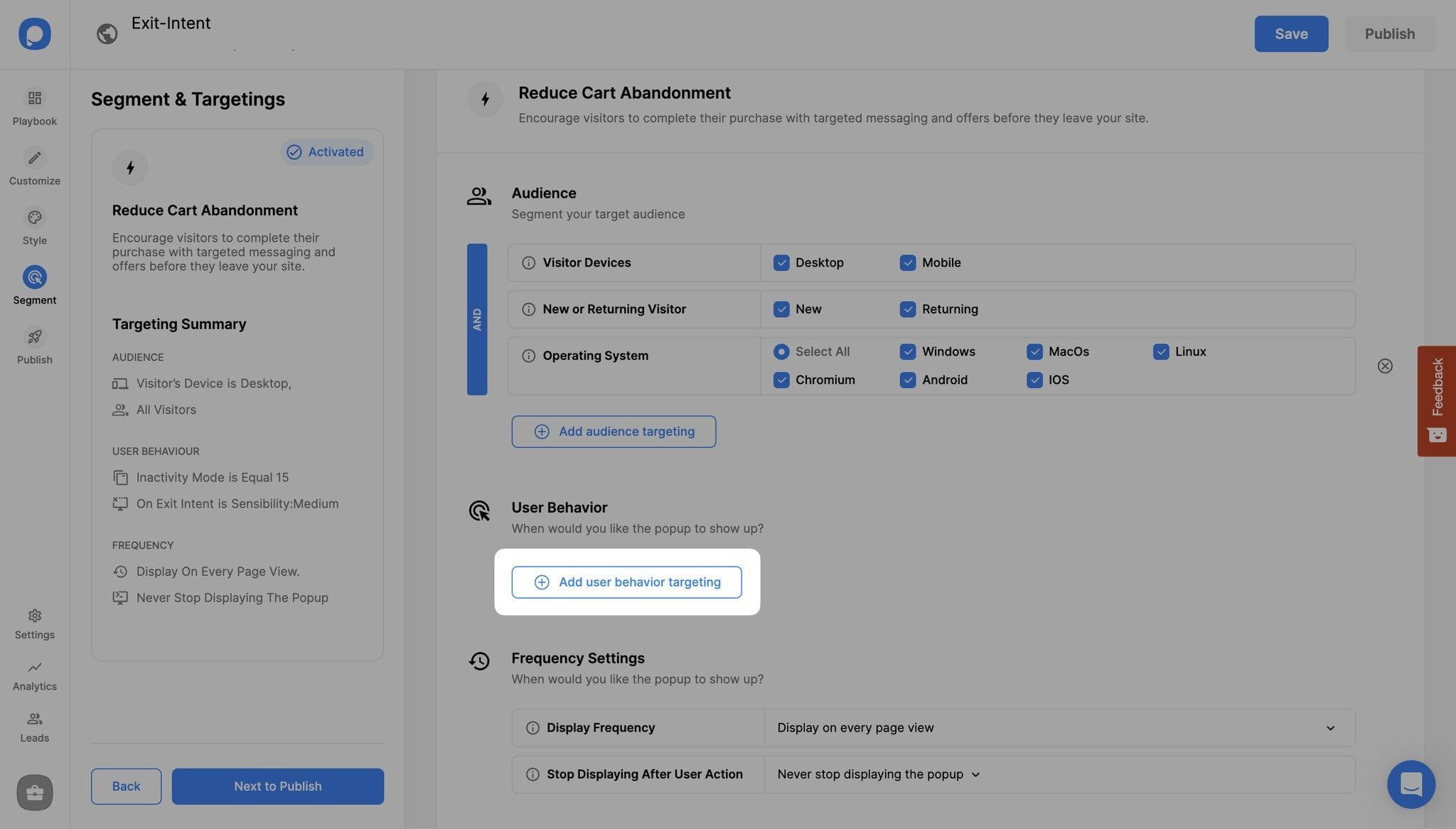
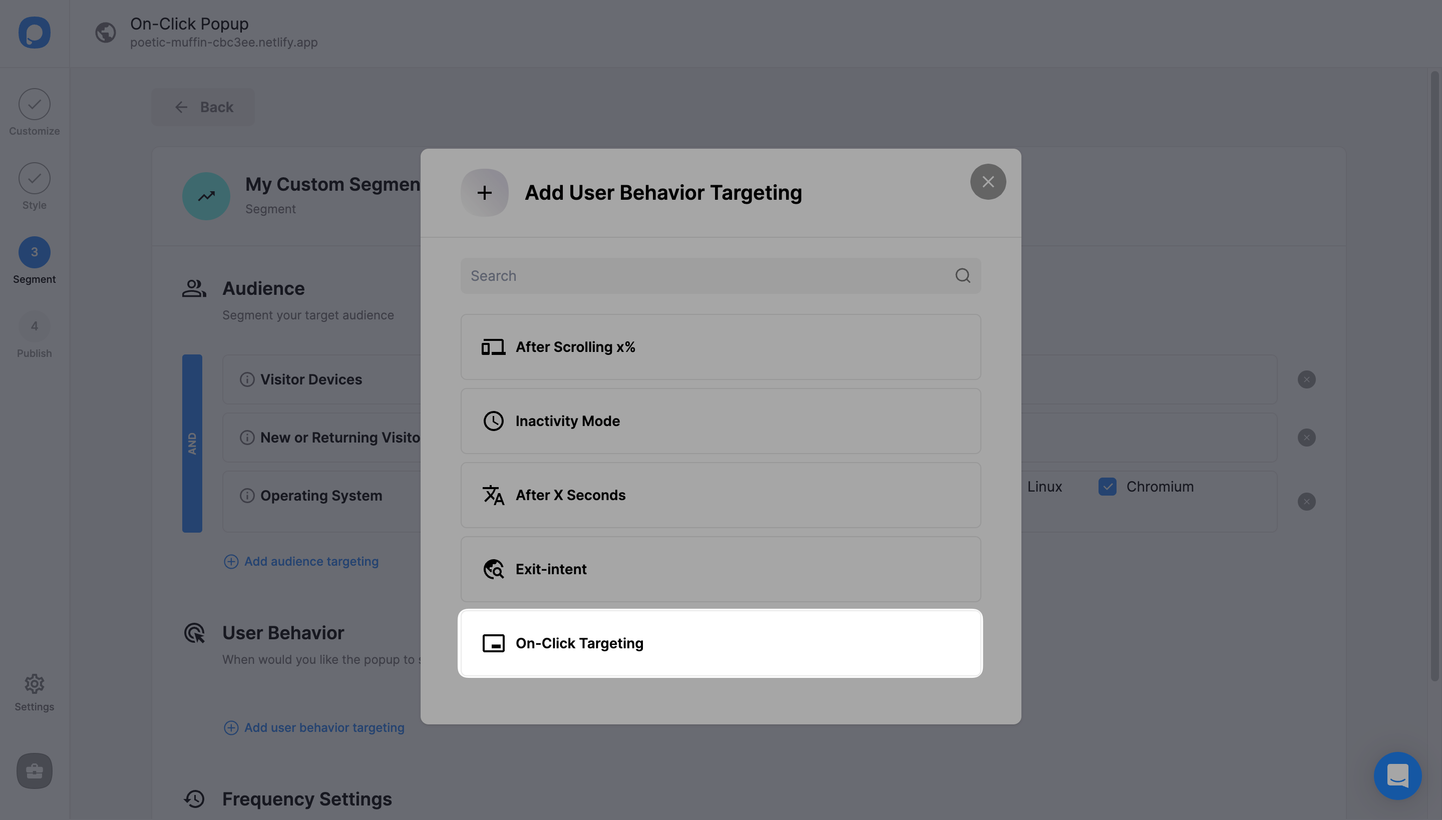
What tends to feel better is showing a popup after some real intent. That could be exit-intent, a click on a button, or another behavior that shows the visitor is at least somewhat engaged.
That’s usually the point where I start thinking about tools. Personally, if I want more control over when the popup appears, I use Popupsmart for that part. What I like is that I’m not limited to one generic popup that shows up for everyone right away. I can wait until someone clicks, scrolls, or shows signs of leaving. That makes the page feel much cleaner.
On-click targeting is especially useful on landing pages. Instead of pushing the form in front of everyone, you let the visitor take a small step first. They click something like “Get the checklist” or “Claim the offer,” and then the popup appears. That feels lighter. It also feels more intentional.
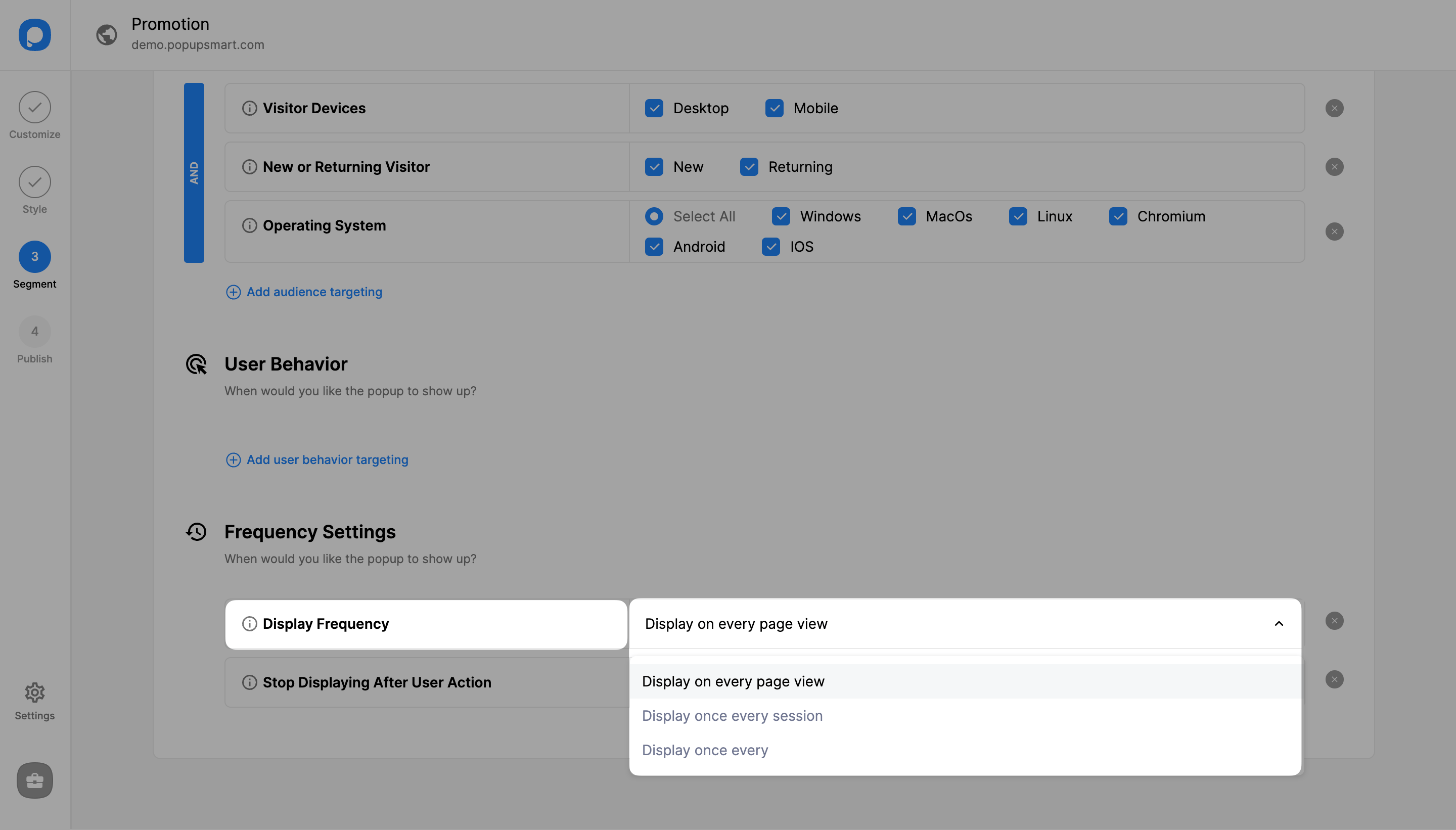
One more thing I’d pay close attention to is frequency.
Even a decent popup can get annoying if people keep seeing it again and again. That’s where a lot of email capture setups go wrong. The first appearance may be fine, but repeated exposure starts to wear people down and makes the page feel messy.
So if I’m using a popup, I want tight control over how often it appears and when it should stop showing after someone interacts with it. That part is easy to overlook, but it makes a big difference in how the whole experience feels.
If I were setting this up from scratch, I’d probably go in this order:
First, make sure the landing page has one clear main goal.
Then place the email ask after the visitor has enough context.
Then tighten the offer so there’s an actual reason to sign up.
Then keep the form short.
And only after that, add a behavior-based popup if it still makes sense.
That order matters. A popup won’t fix a weak offer, and a tool won’t fix bad timing.
When the basics are right, though, email capture gets much easier. The page feels cleaner, the ask feels more natural, and people are a lot less likely to bounce the second they feel pressure.
If you have another question around timing, incentives, or form placement, send it over and I’ll help shape that one too.