Why Your Popup Submission Rate Is Low (And What to Fix First)
Low popup submission rates are almost always caused by one or more of these six problems: a weak offer, poor trigger timing, too many form fields, mismatched design, broken mobile experience, or wrong audience targeting. The 2025 average across 10,000+ Popupsmart campaigns is 3.49%. If you’re below 1.5%, something specific is broken.
Your popup is showing. People are seeing it. But almost no one is submitting. That gap — between impressions and conversions — is where most stores silently bleed potential customers every single day.
I’m Emre, co-founder of Popupsmart. Over the past several years I’ve personally reviewed popup setups for thousands of our customers — e-commerce stores, SaaS products, agencies, local businesses. When someone reaches out saying their popup isn’t converting, I can usually spot the problem within the first 60 seconds of looking at their campaign settings. The same issues come up over and over again.
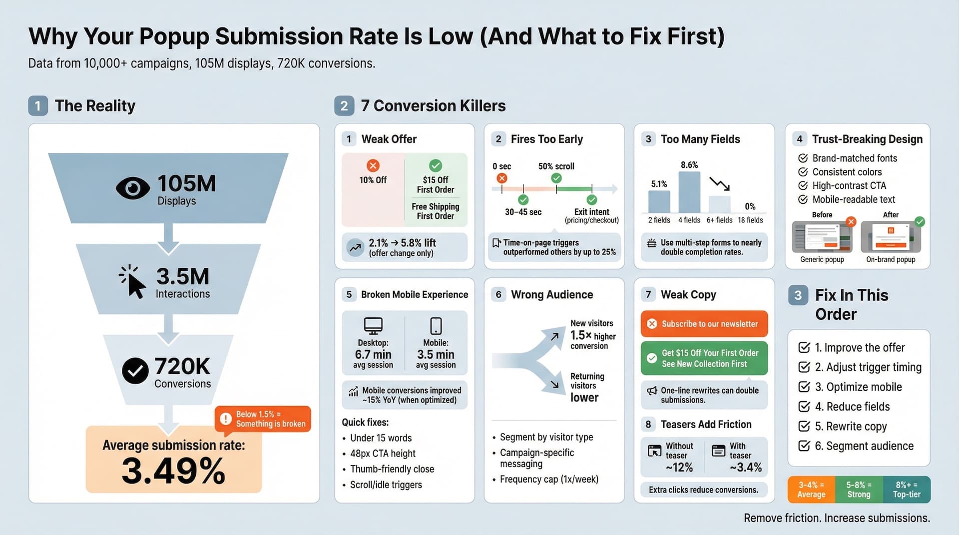
We recently published our Popup Conversion Benchmark Report 2025, analyzing over 10,000 real Popupsmart campaigns — 105 million displays, 3.5 million interactions, 720,000 conversions. The average submission rate across all of those campaigns? 3.49%.
If you’re sitting below 1.5%, something specific is broken. Here’s where to look.
1) Your Offer Isn’t Worth the Email Address
This is the most common issue, and stores almost never want to hear it.
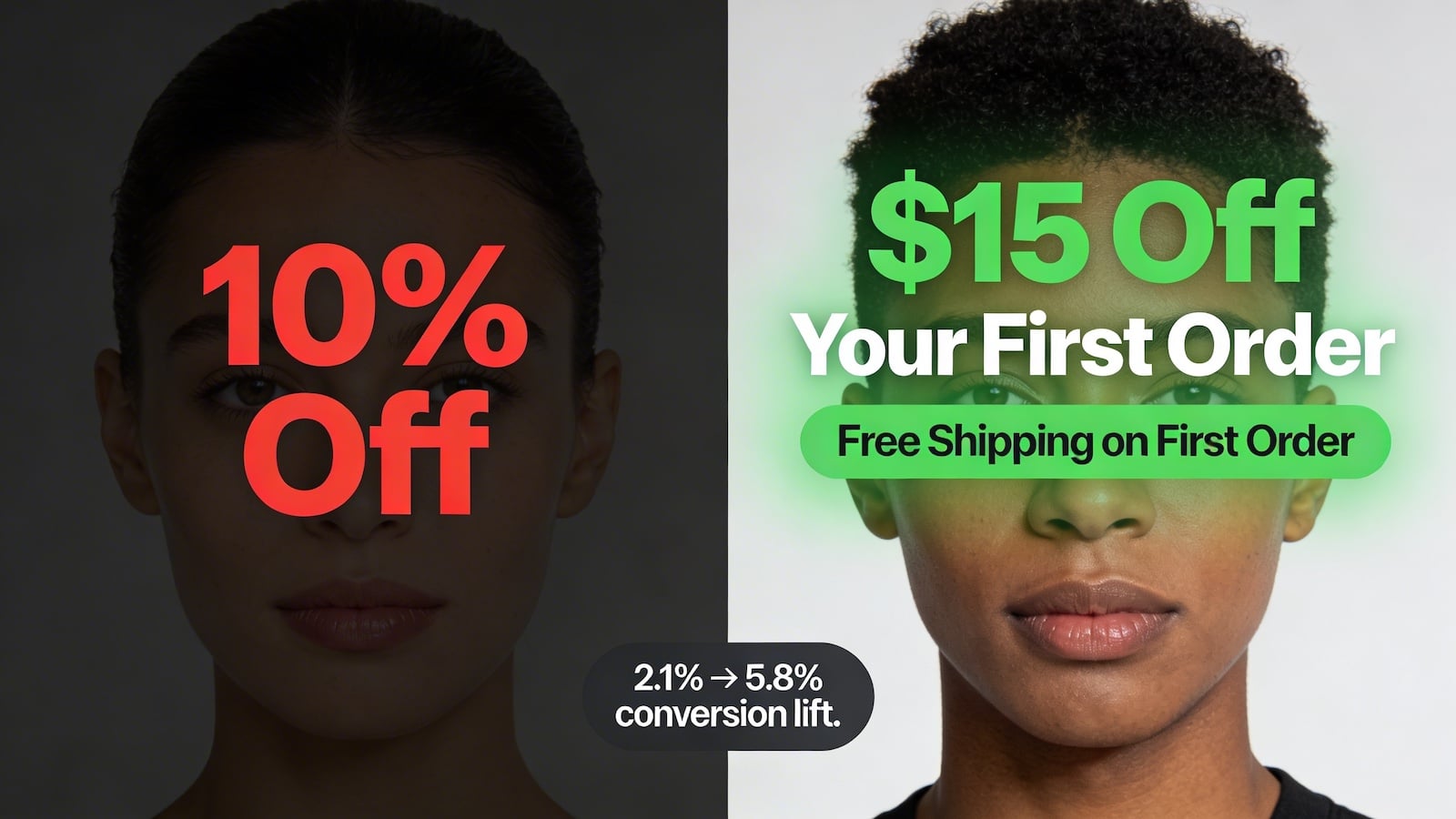
A 5% discount isn’t compelling in 2025. People are conditioned to ignore it. They’ve trained themselves to close popups automatically, the same way they ignore banner ads. If your offer doesn’t make someone pause, they won’t pause.
What works: free shipping thresholds, first-order dollar-off deals ($15 off your first order converts better than 10% off in most niches), or access to something genuinely exclusive. Think about what your audience actually wants, not what’s easiest for you to give.
I tested this directly on a Popupsmart client in the home goods space. Switching from “10% off” to “Free shipping on your first order” lifted their submission rate from 2.1% to 5.8% with no other changes. Same timing, same design, different offer.
2) The Popup Fires Too Early
Showing a popup the second someone lands is the fastest way to get closed. That visitor doesn’t know you yet. They have zero reason to trust you with their email.
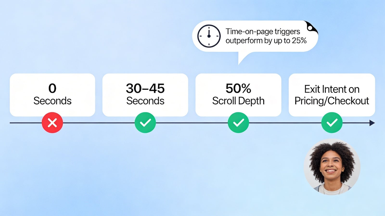
Wait for intent signals. Our benchmark data shows time-on-page triggers outperformed all other trigger types by up to 25%. Fire after 30–45 seconds on page, after they’ve scrolled 50% down, or when they show exit intent on a high-value page like pricing or checkout.
Scroll-based triggers are underused on content-heavy pages. When someone has read 50% of your blog post and you offer them a relevant content upgrade, the intent match is high. That converts. A popup that fires after 3 seconds on the homepage? That’s just noise.
3) The Popup Design Breaks Trust
A popup that looks mismatched from your store signals something is off, even if visitors can’t articulate why. They close it out of instinct.
Your popup should feel like it belongs on your site. Matching fonts, matching color palette, photography that fits your brand aesthetic. A generic stock-photo popup on a premium skincare brand is a trust killer.
Also check: Is your CTA button visible? Does it have enough contrast? Is the text large enough on mobile? Small design failures compound.
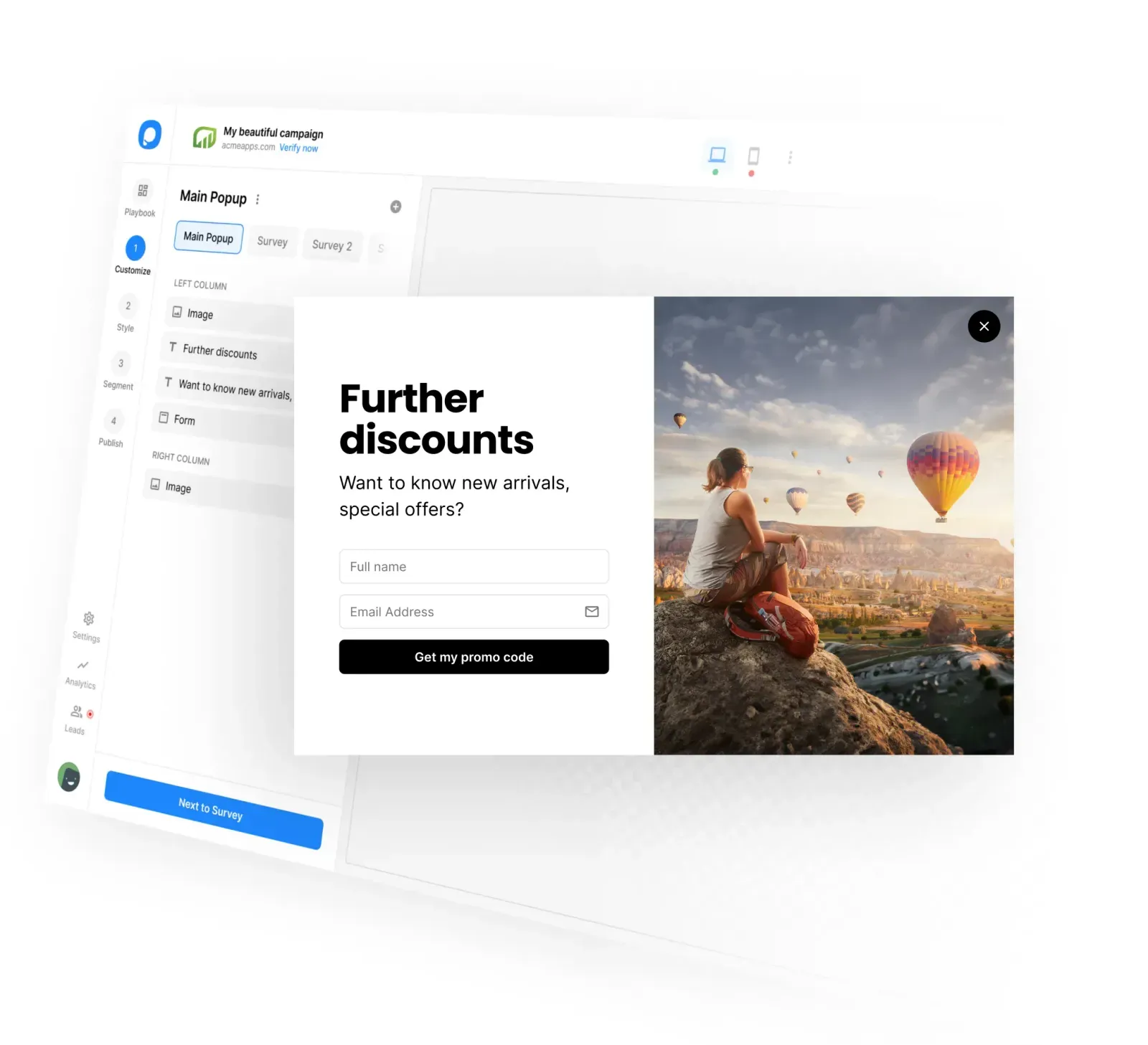
4) Your Form Has Too Many Fields
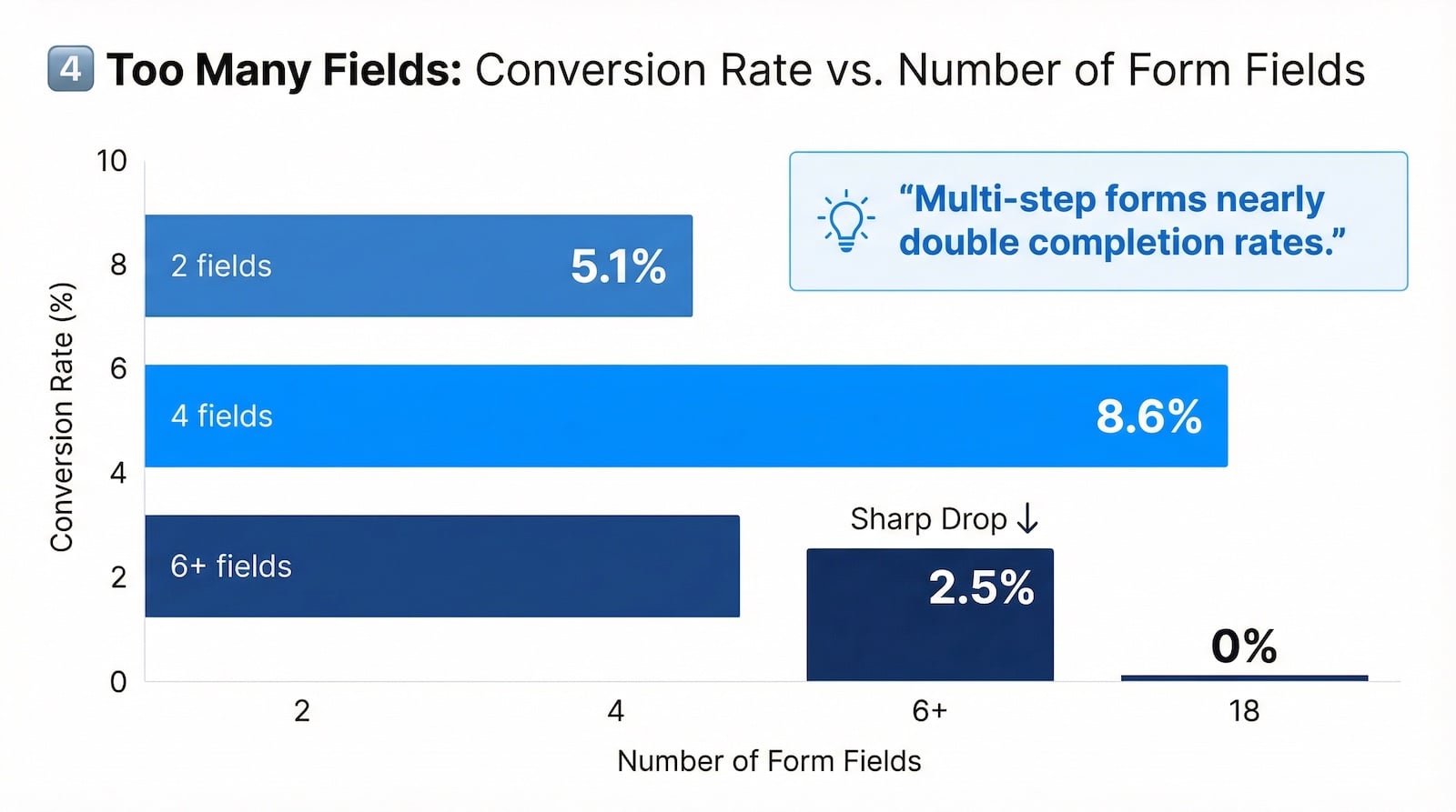
Every extra field you add cuts conversions. This isn’t a theory — our data makes it concrete.
Two-field forms averaged a 5.1% conversion rate in our dataset. Four-field forms peaked at 8.6% when the offer was strong and traffic was high-intent. Once you push past six fields, performance falls off. At eighteen fields, conversion in our dataset dropped to zero.
Email only, or email + first name at most for cold traffic. You can collect more data later once you have the relationship. Right now, you’re asking a stranger for their phone number before you’ve introduced yourself.
If you genuinely need more information, use a multi-step form. Ask for the minimum upfront, then follow up after initial engagement. Completion rates nearly double compared to showing all fields at once.
5) Mobile Experience Is Broken
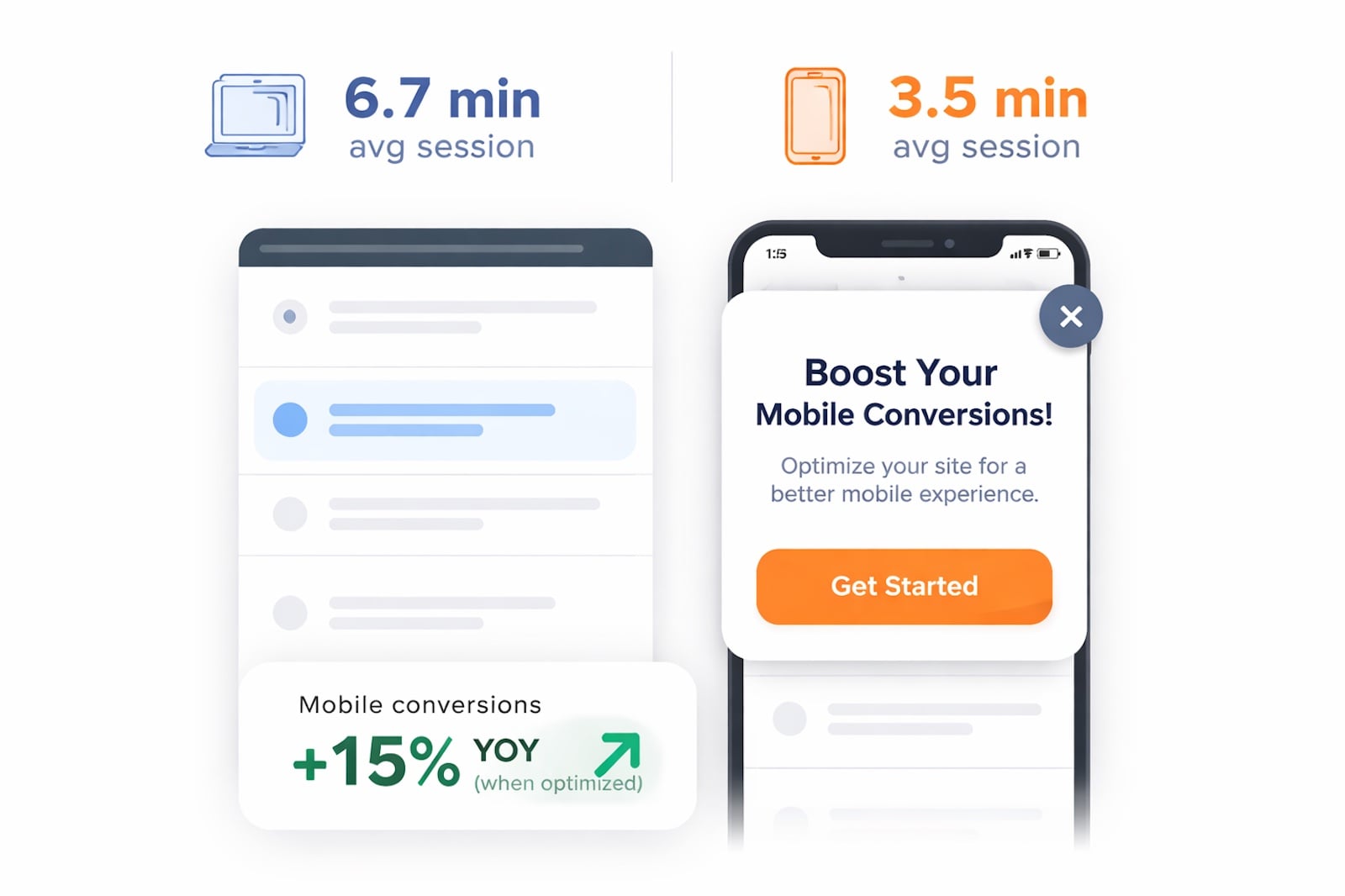
More than half your traffic is on mobile. Our benchmark data shows mobile conversion rates improved ~15% year-over-year — but only for campaigns that were actually optimized for small screens.
If your popup covers the full screen, makes text hard to read, or puts the close button somewhere a thumb can’t reach, you’re creating a frustrating experience that gets closed immediately. Desktop visitors average 6.7 minutes on-site; mobile visitors average 3.5 minutes. You have less time and less patience to work with.
Test your popups on an actual phone. Not a browser simulation. A real device. You’ll catch things you’d never see on desktop.
Practical fixes: keep copy under 15 words, use scroll depth or idle time triggers instead of time-on-page, and make sure your CTA button is at least 48px tall so it’s actually tappable.
6) You’re Showing It to the Wrong People
Showing a “first-time visitor” email capture popup to a returning customer who already subscribed is noise. Showing a discount popup to someone who arrived from a high-intent paid ad that already had a discount offer creates confusion.
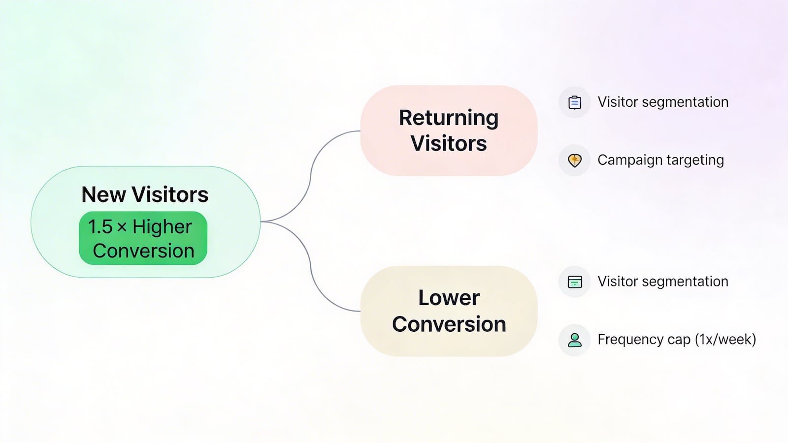
Our data shows new visitors convert at nearly 1.5× the rate of returning visitors. That’s because first-time visitors are in a fresh attention window — they haven’t seen your offer before. Returning visitors have. Repeating the same 10% off coupon to someone who’s visited three times and never converted tells you the offer isn’t the problem: the messaging is.
Segment your triggers. New visitors get the acquisition popup. Returning logged-in customers don’t. People from specific campaign URLs get campaign-specific messaging. Cap popup frequency for returning visitors to once per week at most — repeated exposure to the same creative destroys trust faster than it builds it.
7) The Copy Doesn’t Address What They Actually Want

“Subscribe to our newsletter” converts terribly. Nobody wakes up wanting more newsletters.
Reframe around the value, not the mechanism. “Get your discount” outperforms “Subscribe.” “See the new collection first” beats “Join our list.” Tell people what they get, not what they’re doing.
One-line copy rewrites can double submission rates. It sounds dramatic, but I’ve seen it happen too many times to dismiss.
What to Audit First
If you’re staring at a low submission rate and don’t know where to start, work through this order:
- Check the offer. Is it genuinely valuable?
- Check the trigger timing. Is it firing too early?
- Check mobile. Is the experience broken on small screens?
- Check the form fields. Are you asking for too much?
- Check the copy. Does it lead with value?
- Check your audience targeting. Are you showing the right popup to the right visitor?
Fix those six things before touching anything else. Most stores find their problem in steps one through three.
The benchmark is clear: 3–4% is the 2025 average, 5–8% is strong, and 8%+ is top-tier. There’s nothing stopping you from getting there — it just requires removing friction one layer at a time.
If you’re running your popups on Popupsmart and want to walk through your specific setup, drop your questions below. Happy to dig in.
I’ve covered what I see most often from the product and data side, but I know there’s more to this story. @berna-partal you’ve been deep in customer conversations for a long time. What patterns are you seeing from your end? Any reasons for low submission rates that I missed here, or things customers bring up that don’t show up in the numbers?
Emre