Currently exploring the nuances of user interface design and have encountered a practical scenario that requires a deeper understanding of two commonly used elements: alert boxes and popup windows.
In a context where user experience and interaction are pivotal, I would appreciate insights into the fundamental differences between alert boxes and popup windows. Specifically, how do their roles and impacts differ when it comes to user engagement and response within a web application?
Furthermore, I am interested in practical examples or case studies illustrating their effective implementation. Your expertise and experiences in this area would be immensely valuable in enhancing my comprehension and application of these UI components. Can you share them if you have any?
Your inquiry about the differences between alert boxes and popup windows in user interface design is a great one.
Since Popupsmart is an expert in this field, let us clearly convey the main difference between these two and help you in the best way possible.
I can group some of the knowledge I have about these two. Categorizing fields and showing the details may directly help you get the difference, I suppose.
Hope the points can help
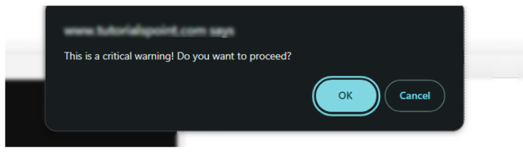
Alert Box, also known as a message box, is a simple dialog that communicates information to the user and requires them to take action to proceed.
→ It’s typically used for critical warnings or to gain confirmation before proceeding with an action.
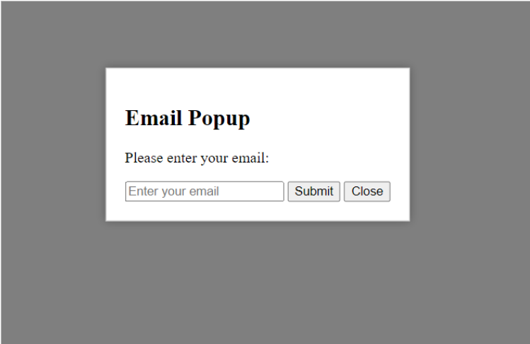
Popup Window is a secondary window that appears over the primary application window. It can contain a wide range of content, from advertisements and notifications to full-size web pages or forms.
→ Popups are more versatile and can be used for interactive tasks.
User Interaction and Engagement
Alert Box:
User interaction is limited to acknowledging the message (usually “OK” or “Cancel”).
It’s modal, meaning it halts other application interactions until addressed.
Popup Window:
Offers more interaction options, like filling out forms or navigating through different sections.
Can be modal or non-modal, allowing for more flexibility in user interaction.
Visual and Functional Impact
Alert Box:
Typically contains minimal text and up to two buttons.
Often used to ensure the user reads important information.
Popup Window:
Can include various elements like text, images, forms, and hyperlinks.
Suitable for extended interactions without leaving the current page context.
Use Cases
→ Alert Box:
Confirmation of an Action:
Deleting a file or sensitive data.
Logging out of an application or website.
Confirming a purchase or booking.
Warning Messages:
Error notifications like incorrect data entry or system errors.
Alerts for unsaved changes or pending updates.
Security warnings, such as unauthorized access attempts.
Critical Information:
Notification of system restart or downtime.
Legal or compliance-related acknowledgments.
Expiry notifications for subscriptions or licenses.
Detailed product descriptions in e-commerce sites.
Interactive tutorials or help guides.
Promotional offers or upselling options.
Interactive Content:
Quizzes or polls to engage users.
Slideshows or galleries for visual content.
Embedded videos or external content links.
User Engagement and Personalization:
Personalized product or content recommendations.
Event reminders or calendar integrations.
Social media sharing options or widgets.
Effective Implementation in UI Design
Alert Box:
Should be used sparingly to avoid overwhelming the user.
Ensure clarity in the message to facilitate quick user decision-making.
Popup Window:
Design for user-friendly interaction, keeping it relevant and non-intrusive.
Consider user control options like easy closing of the window.
Their effective use largely depends on the context of interaction and the type of information or response required from the user.
Alert boxes are best for critical, immediate decisions, whereas popup windows are ideal for more detailed interactions and providing additional content without diverting from the main application flow.
However, if you choose to create popup window for your website, you can always prefer a popup builder like Popupsmart to save your time and keep track of your analytics as well.
Your question reminded me of previous discussion topics and I checked them. There is also a question that reveals the difference between modals, popups, and overlays. Therefore, maybe you can check it as well. For more information, we have lots of blog posts that you can take a look at:
Both modal and popup windows have their unique uses in a web application.
Modals are part of the same window and are great for keeping the user in a context, while popups create a new window, which can be useful for external links or information that doesn’t need to be in the same context.
It’s essential to use these two judiciously to enhance the user experience.
You can use the following code to create a modal with JavaScript:
<div id="myModal" class="modal">
<div class="modal-content">
<span class="close">×</span>
<p>Modal content.</p>
</div>
</div>
<script>
var modal = document.getElementById("myModal");
var btn = document.getElementById("myBtn");
var span = document.getElementsByClassName("close")[0];
// When the user clicks on the button, open the modal
btn.onclick = function() {
modal.style.display = "block";
}
// When the user clicks on <span> (x), close the modal
span.onclick = function() {
modal.style.display = "none";
}
// When the user clicks anywhere outside of the modal, close it
window.onclick = function(event) {
if (event.target == modal) {
modal.style.display = "none";
}
}
</script>
You can use the following code to create a popup with JavaScript:
<!DOCTYPE html>
<html lang="en">
<head>
    <meta charset="UTF-8">
    <meta http-equiv="X-UA-Compatible" content="IE=edge">
    <meta name="viewport" content="width=device-width, initial-scale=1.0">
    <title>Simple Popup</title>
    <style>
        /* CSS styles for the popup */
        #popup {
            display: none;
            position: fixed;
            top: 50%;
            left: 50%;
            transform: translate(-50%, -50%);
            padding: 20px;
            background-color: #fff;
            border: 1px solid #ccc;
            box-shadow: 0 0 10px rgba(0, 0, 0, 0.3);
            z-index: 9999;
        }

        #overlay {
            display: none;
            position: fixed;
            top: 0;
            left: 0;
            width: 100%;
            height: 100%;
            background-color: rgba(0, 0, 0, 0.7);
            z-index: 9998;
        }
    </style>
</head>
<body>

<!-- Popup content -->
<div id="popup">
    <p>Hello! This is a simple popup content.</p>
    <button onclick="closePopup()">Close</button>
</div>

<!-- Button to trigger the popup -->
<button onclick="openPopup()">Open Popup</button>

<!-- Overlay (background layer) -->
<div id="overlay"></div>

<script>
    // Function to open the popup
    function openPopup() {
        document.getElementById("popup").style.display = "block";
        document.getElementById("overlay").style.display = "block";
    }

    // Function to close the popup
    function closePopup() {
        document.getElementById("popup").style.display = "none";
        document.getElementById("overlay").style.display = "none";
    }
</script>

</body>
</html>
You can always change the code depending on your expectations, and let me know if you have any questions.