Hello all,
I’m in the process of revamping our website and have been playing around with the idea of incorporating a banner on the homepage.
The primary goal is to spotlight our upcoming seasonal sale and feature new product arrivals. We’ve noticed a slight dip in engagement on our main page recently, and I’m hoping this could be an effective way to catch our visitors’ attention and direct them towards our key offerings.
Before I make any final decisions, I’d love to gather some insights from this community. Have any of you integrated a banner for similar reasons?
If so, did you notice a positive impact on user engagement or sales conversions? Any specific design tips or strategic advice would also be greatly appreciated!
3 Likes
Hi Jackie!
Absolutely, banners can be incredibly beneficial, and we have also been there.
A while back, our e-commerce site was gearing up for our annual Black Friday sale, which we knew had the potential to boost our sales and attract new customers significantly. We created a captivating banner for our homepage to announce the sale.
The moment we put up the banner featuring bold colors that matched our branding and a clear, irresistible ‘50% Off Site-Wide’ message, the results were astonishing. The banner didn’t just grab attention; it became the talk of our customer base. We included a ‘Shop Now’ button that led directly to our deals page, making the shopping process seamless.
Thanks to the banner, our website traffic spiked significantly, with analytics showing that many visitors interacted with the banner. Not only did our sales figures see a substantial increase compared to the previous year, but we also noticed a lower bounce rate during the sales period. Customers were spending more time browsing through our products, and the average order value went up.
Plus, since the banner did more than we expected, it boosted our brand awareness because our customers shared our website on social media, primarily driven by the attractive offer highlighted in the banner. Therefore, word-of-mouth marketing did its work.
I suggest that if you consider adding a banner to your website, don’t waste time and do it as you like. Its benefits will grow for your current and future actions.
3 Likes
Hello,
In addition to what Amari shared, using a banner on your homepage is a powerful tool to consider for boosting engagement and conversions, especially when done correctly.
From our experience, there are several key elements to consider for making your banner effective:
-
Clear Message: Ensure your banner’s message is concise and to the point. Users should understand the value or offer at a glance.
-
Compelling Visuals: Use high-quality, attention-grabbing images or graphics relevant to your message. This visual appeal is crucial for capturing interest.
-
Strong Call-to-Action (CTA): Your banner should include a clear, compelling CTA that prompts users to take the next step, whether it’s ‘Shop Now’, ‘Learn More’, or ‘Sign Up’. Make the CTA button stand out with contrasting colors or designs.
-
Brand Consistency: The banner should reflect your brand’s style and colors to maintain consistency across your website. This helps in reinforcing brand recognition.
-
Strategic Placement: Position your banner prominently on your homepage without overwhelming the overall design. It should be one of the first things visitors see, not obstructing navigation or content.
-
Timing and Relevance: Update your banners regularly to align with current promotions, seasons, or events to keep the content fresh and relevant to your audience.
-
Mobile Optimization: Ensure your banner looks great and functions well on mobile devices, considering the growing number of users browsing on smartphones.
With these elements, you can create a banner that draws attention, effectively communicates your message, and encourages action. It’s also worthwhile to A/B test different banners to see which resonates best with your audience.
3 Likes
Thank you for your answers. Both of them helped me create a scenario for our own case.
And I have another question if you want to contribute to my knowledge. Is there any alternative for banners? If I don’t want to prefer using banners, what can I use to cover its place with the same benefits?
After you talked about its benefits, I just increased my hope for banners. Yet, I thought we should have a backup plan to replace banners.
Waiting for your responses 
2 Likes
Hey Jackie,
I just wanted to participate in your discussion when I saw your question.
Actually, your question is in the right place to replace banners since popups can be a great alternative for banners to make your announcement and drive more sales conversions.
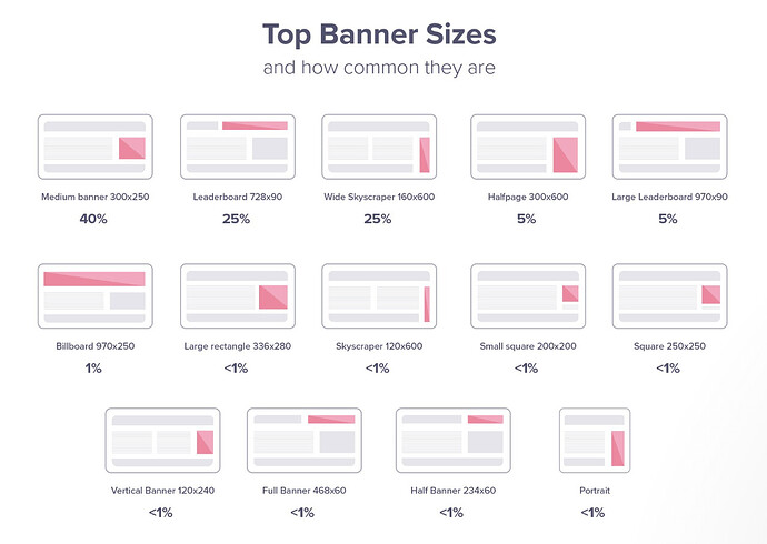
Popups can significantly enhance website effectiveness by capturing user attention at strategic moments. Unlike banners, which maintain a constant presence, popups are designed to appear based on specific user actions, such as attempting to exit the page or after a set amount of time on the site. This targeted engagement makes popups particularly useful for conveying urgent messages, promoting offers, or encouraging sign-ups.
Source: Match2One
While popups offer direct engagement, banners provide a subtler, ongoing form of communication. They’re ideal for consistently presenting branding messages, offers, or alerts without interrupting the user’s experience.
The strategic use of both popups and banners can create a balanced engagement strategy. Banners ensure continuous visibility of key messages, while popups offer targeted interventions to prompt immediate action.
It’s important that you use properly timed and relevant popups to complement banners, enhancing overall website effectiveness without detracting from user satisfaction.
I hope that this answer could be a great solution for your search for a banner alternative.
4 Likes
Hello from me as well,
I wanted to add an addition to the answers when it comes to the relationship between banners and popups.
Talking about grabbing attention without relying solely on banners, popups offer some versatile options. Plus, you can create popup banner coupon codes to use.
Different types serve unique purposes and can be a strategic choice depending on your website’s goals:
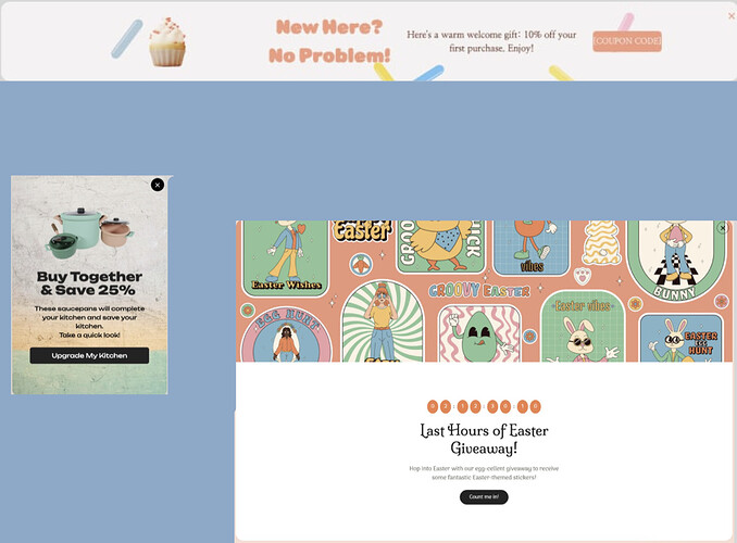
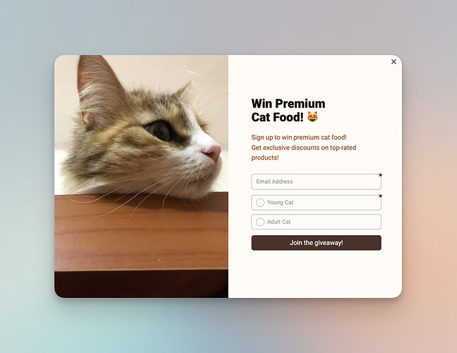
Lightbox Popups: These are the classic popups that appear in the center of the screen, dimming the background content. They’re hard to ignore, making them great for important announcements or offers. Unlike static banners, they demand immediate attention but should be used sparingly to avoid user annoyance.
Clone this Popup!
Floating Bars: These are less intrusive than lightbox popups and sit at the top or bottom of the page. They scroll along with the user, providing a constant yet subtle reminder. Think of them as a more dynamic banner, perfect for ongoing promotions or alerts.
Clone this Popup!
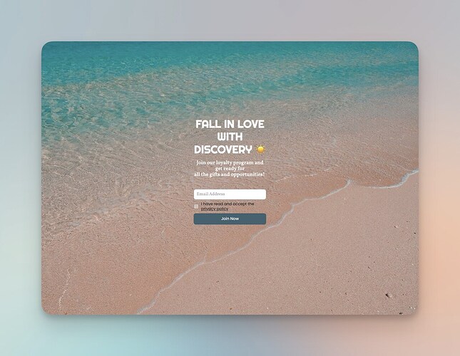
Full-Screen Popups: These take over the entire screen, providing a distraction-free environment for the message. They’re very effective for capturing leads or making a big announcement. However, they should be used effectively, as they momentarily halt the user’s interaction with your site.
Clone this Popup!
While banners are great for a continuous presence, these popup types offer different levels of engagement and can be more effective in driving specific actions, from lead capture to sales conversions. The key is to match the popup’s style and trigger to the nature of the message and the desired user action.
Hope you can find your inspiration for your campaign. Good luck in advance!
2 Likes
You’re all great! 
Thank you for all the answers and contributions. I’ll be evaluating your advice and alternatives with the team.
I really appreciate your participation, everyone!!
3 Likes


